Should every wall have something on it? Not necessarily. While some walls benefit from wall art to create focal points and enhance aesthetics, others can be left blank to provide visual rest and prevent clutter. The key is to find a balance that reflects your personal style and maintains a harmonious, inviting space.
Personal Preference and Style: Finding the Right Balance
When it comes to wall decor, personal preference plays a huge role in determining what works best for your space. Everyone’s taste is different, and what might feel like the perfect balance for one person could feel overwhelming or too sparse for another. We’ve created this guide to find your unique decorating style to help you out.
But how do you navigate the vast spectrum of styles, from minimalist designs with bare walls to maximalist or eclectic styles brimming with abundant decor?
The Spectrum of Styles in Interior Design
Imagine a spectrum: on one end, you have minimalism, where walls are left mostly bare, creating a serene and uncluttered environment. On the other end, you have maximalism, characterized by a lively and eclectic mix of artworks, making each wall a feast for the eyes.
Both extremes can be appealing, but for most of us, the sweet spot lies somewhere in between.

Finding Balance in Wall Decor
Finding this balance is key to creating a harmonious and inviting home. Why should we aim for balance? Because it allows your eyes to rest and appreciate the art without feeling overwhelmed.
Too much wall art can make a space feel cluttered, while too little can make it feel stark and unwelcoming. Striking the right balance not only enhances the beauty of your artworks but also makes your room feel more cohesive and thoughtfully designed.

Practical Tips for Achieving Balance
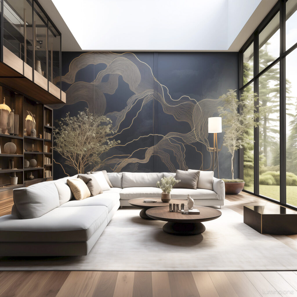
For example, in a living room, you might choose to make one wall a focal point with a large piece of art or a curated gallery wall, while leaving the opposite wall blank to provide visual rest. This approach helps the art stand out and prevents it from getting lost in a sea of decor.
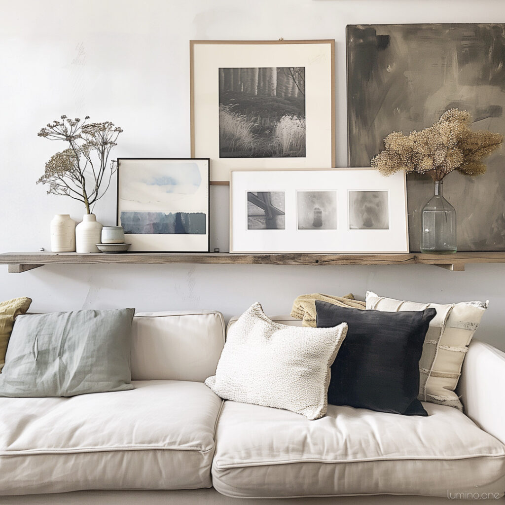
Similarly, walls behind major pieces of furniture like sofas or sideboards often benefit from artwork to balance the visual weight and enhance the room’s aesthetic. And you can learn how to find the perfect size for your art over the sofa here.
So, how do you know if you’ve got the balance right? A good rule of thumb is to step back and take a look at the room as a whole. Does your eye move comfortably around the space, or is it drawn to a specific area? Do you feel relaxed and at ease, or overwhelmed and distracted?
Remember, this is no right or wrong way of doing it: it’s your space and the goal is to make you feel good in it. Read on for more practical tips on finding that perfect balance.
Is it Okay to Have a Blank Wall?
In the world of interior design, we often ask ourselves, should every wall have something on it? The simple answer is, not necessarily. Blank walls can be just as powerful as decorated ones, providing several benefits that enhance the overall aesthetic and functionality of a space.
Creating a Sense of Openness in a Room
One of the key advantages of blank walls is that they create a sense of openness. In a room where every wall is covered with art or decor, the space can quickly feel cramped and overwhelming. By leaving some walls bare, you allow the room to breathe, giving it a lighter and more expansive feel.
This is particularly important in smaller rooms or areas with limited natural light, where a sense of openness can make a significant difference.
Avoiding Visual Clutter
Blank walls also play a crucial role in avoiding visual clutter. Imagine walking into a room where every inch of wall space is filled with pictures, shelves, and decorations. It can be visually exhausting and make it hard to appreciate individual pieces.
By intentionally leaving some walls blank, you create a clean, uncluttered look that helps to highlight the decor you do choose to display. This approach ensures that each piece of art or decoration gets the attention it deserves without competing for space.
Enhancing Aesthetic Appeal and Functionality of a Space
There are specific situations where blank walls can enhance both the aesthetic appeal and functionality of a room:
Hallways and transitional spaces: These areas often benefit from minimal decoration to maintain a sense of flow and avoid a cluttered feel.

Behind large furniture: Leaving the wall behind a significant piece like a sofa or bed blank can help to balance the visual weight and prevent the space from feeling too busy.

Modern and minimalist designs: Bare walls are a staple in modern and minimalist design styles, contributing to a sleek and sophisticated look. They provide a canvas for the room’s other elements to shine, creating a harmonious and balanced environment.

To sum up, blank walls are not only okay but can be incredibly beneficial in creating a balanced, aesthetically pleasing, and functional home. So next time you’re decorating, consider giving some walls a break. You might find that less really is more.
Are Bare Walls in Style? Minimalism and Modern Trends
In recent years, minimalism has surged in popularity, and with it, the trend of using blank walls as a design statement. This approach is not only stylish but also practical, aligning perfectly with the principles of minimalist decor.
Embracing Minimalism in Wall Decor
Minimalists approach decoration with a focus on quality over quantity. Rather than filling every inch of wall space, they choose a few high-quality pieces that make a significant impact. This intentional selection process ensures that each item on display is meaningful and contributes to the overall aesthetic. Why crowd your walls with mediocre pieces when a few well-chosen artworks can speak volumes?
Current Trends Favoring Blank Walls
Several current trends in interior design emphasize the beauty and functionality of blank walls:
Scandinavian design: Known for its clean lines and simplicity, Scandinavian interiors often feature blank walls to maintain a serene and uncluttered look.

Japandi style: A blend of Japanese and Scandinavian design principles, this trend highlights minimalism, natural materials, and the use of blank walls to create calm, harmonious spaces.

Industrial chic: This style often incorporates raw, unfinished walls, embracing their natural texture and character as part of the decor.

These trends demonstrate that blank walls can be both a deliberate design choice and a reflection of a broader aesthetic movement.
In conclusion, bare walls are not only in style but are a key element of modern minimalist design. By focusing on quality over quantity and embracing the beauty of simplicity, you can create a stylish and tranquil home. So, the next time you’re tempted to fill every wall with decor, consider leaving some space blank. You might just find that those empty walls add the perfect touch of elegance and sophistication to your space.
Do I Have Too Much Decor? Balancing Decor and Clutter
When it comes to decorating your home, it’s easy to get carried away. But what makes your home look cluttered? Often, it’s not the individual pieces themselves but the sheer volume and how they’re arranged that create a sense of chaos. Here are some tips to help you strike a balance between decor and clutter, ensuring your home looks stylish and inviting.

What Makes Your Home Look Cluttered?
Clutter can sneak up on you. Too many small items on display, mismatched decorations, and overcrowded walls can quickly make a space feel overwhelming. A room packed with decor lacks focal points, making it hard for the eye to rest. Is your decor enhancing your space or overwhelming it?
Tips for Achieving a Balanced Look
To achieve a balanced look without over-decorating, consider these strategies:
- Edit Ruthlessly: Less is often more. Remove items that don’t add significant value or joy to your space.
- Create Focal Points: Focus on a few key pieces that draw attention and provide visual interest.
- Use Negative Space: Allow for empty spaces between items to give your eyes a place to rest and prevent visual clutter.
Signs of Over-Decorating and Strategies for Decluttering
Over-decorating can make your home feel chaotic. Look out for these signs:
- Difficulty Cleaning: If dusting your decor takes longer than cleaning the rest of the room, you might have too much out.
- Visual Overload: If your eyes don’t know where to look, it’s a sign there’s too much happening.
- Lack of Cohesion: If your space feels disjointed, it might be because of too many clashing items.
To declutter effectively:
- Group Similar Items: Arrange items in groups based on theme, color, or style to create cohesion.
- Rotate Decor: Store some pieces and rotate them periodically to keep your decor fresh without overcrowding.
- Prioritize Functionality: Ensure that decorative items don’t hinder the functionality of your space.
Creative Solutions for Displaying Multiple Pictures

If you love displaying multiple pictures but want to avoid overwhelming your space, consider these creative solutions:
- Gallery Wall: Create a cohesive gallery wall with a mix of sizes and frames, but keep a consistent theme or color palette to unify the display. Learn the art of putting together an expensive-looking gallery wall on a budget here.
- Picture Ledges: Use picture ledges to layer frames, allowing for flexibility in arrangement and easy updates.
- Grid Layout: Arrange pictures in a symmetrical grid for a clean, organized look that avoids visual clutter.
Balancing decor and avoiding clutter is about finding the right mix of pieces that bring joy and enhance your space without overwhelming it. By being mindful of what you display and how you arrange it, you can create a home that is both beautiful and inviting. Remember, sometimes less truly is more. So, why not take a step back and see what you can simplify?
Should Every Room Have a Feature Wall? How to Use Focal Points in Your Interior
When it comes to interior design, the concept of a feature wall plays a significant role in creating focal points that draw the eye and add character to a room. But should every room have a feature wall? Let’s explore the purpose of feature walls, how to choose the right one, and when it might be best to leave some walls blank.
What is a Feature Wall?
A feature wall, also known as an accent wall, is a wall that stands out from the others in a room. It is typically decorated with a different color, pattern, texture, or artwork to create a focal point.
The purpose of a feature wall is to add visual interest and highlight a specific area, drawing attention to a particular part of the room.

Guidelines for Selecting a Feature Wall
Not every wall is suited to become a feature wall. Here are some guidelines to help you choose the right one:
- Choose a Natural Focal Point: Opt for a wall that already draws attention, such as the wall behind a fireplace, the headboard in a bedroom, or the main wall in a living room.
- Consider the Room’s Function: Select a wall that enhances the room’s primary function. For instance, in a dining room, the wall where the dining table is placed can be a great feature wall.
- Balance with the Room’s Layout: Ensure the feature wall complements the overall layout and doesn’t disrupt the flow of the room.
When and Why to Leave Walls Blank
While feature walls can add a lot of character, it’s also important to know when to leave walls blank. Why might it be beneficial to have empty walls?

- Create Visual Rest: In rooms with a lot of decor or busy patterns, blank walls provide a necessary visual break, preventing the space from feeling overwhelming.
- Highlight Other Elements: Sometimes, blank walls can help other elements, such as furniture or architectural features, stand out more effectively.
- Maintain Simplicity: In minimalist or modern designs, blank walls contribute to a clean, uncluttered look, which is central to these styles.
Design Tips for Visual Interest
Creating visual interest doesn’t always require a feature wall. Here are some alternative tips:
- Use Art Strategically: Place a single large piece of art on a blank wall to create a focal point without overwhelming the space.
- Incorporate Texture: Use textured wall coverings, such as wood panels or fabric, to add depth and interest without the need for bold colors or patterns.
- Play with Lighting: Use strategic lighting, such as wall sconces or spotlighting, to highlight architectural features or artwork, adding depth and interest to your space.
In conclusion, feature walls can be a powerful tool in interior design, but they are not a necessity for every room. By understanding when and where to use them, and knowing when to embrace blank walls, you can create a balanced and visually appealing home. Remember, the key is to create focal points that enhance your space without overwhelming it. So, why not take a moment to consider whether your walls are working for or against your overall design?
Can You Have Too Many Pictures on Your Walls? How to Pull Off a Maximalist Style
Maximalism is all about embracing abundance and showcasing your personality through decor. But can you have too many pictures on your walls? The key to pulling off a maximalist style without creating visual chaos lies in strategic planning and thoughtful design.
Create a Focal Point
In maximalist design, it’s crucial to designate one wall or area as the focal point for your display. This helps to draw the eye and anchor the room. Choose your favorite and most striking pieces and arrange them in this designated area. By concentrating the visual interest in one spot, you create a centerpiece that grounds the room and prevents the space from feeling scattered.
Example: Imagine a living room where the wall behind the sofa is adorned with a mix of bold art pieces. This wall becomes the room’s focal point, immediately catching the eye and setting the tone for the space.
Use Themes or Color Palettes
To maintain cohesion and avoid visual clutter, select a theme or consistent color palette for your wall art. This ties together diverse elements and ensures a harmonious look. Whether you prefer a collection of botanical prints, black and white photographs, or colorful abstract paintings, sticking to a theme helps create a unified and aesthetically pleasing display.
Example: If you love travel photography, dedicate a wall to your favorite travel shots, using similar frames and a consistent editing style to unify the collection.

Vary the Layout and Spacing
Experiment with different layouts to find what works best for your space. While maximalism celebrates abundance, it’s important to leave some negative space between pieces. This allows each artwork room to breathe and prevents the display from becoming overwhelming. Try asymmetrical arrangements, salon-style gallery walls, or even a grid pattern, adjusting the spacing to keep the composition balanced.
Example: A gallery wall can be arranged in a loose, organic layout with varied spacing, or it can follow a structured grid with equal gaps between frames. Both approaches can work beautifully in a maximalist setting.
Maximalism doesn’t mean throwing everything you own onto the walls. Instead, it’s about curating a collection that reflects your style while maintaining balance and harmony. By creating a focal point, using cohesive themes or color palettes, and varying the layout and spacing, you can achieve a maximalist style that feels intentional and visually engaging.
Examples of Where an Empty Wall Needs to Have Something on It
While blank walls can offer a sense of calm and simplicity, there are situations where adding wall art can transform a space from empty to inviting. Should every wall have something on it? Not necessarily, but here are a few examples where an empty wall can benefit greatly from some decoration.
Large Blank Walls

In spacious living rooms, large blank walls can feel empty and uninviting. Adding wall art creates a focal point and makes the space feel more complete. A large piece of art or a well-curated gallery wall can bring life to an expansive wall, making the room feel more balanced and visually appealing.
Example: Imagine a living room with a large blank wall behind the sofa. Adding a series of framed prints or a large, bold painting can turn this empty space into a stunning focal point that anchors the room.
Walls Behind Furniture

Walls behind major pieces of furniture, like sofas or sideboards, often benefit from artwork to balance the visual weight and enhance the room’s aesthetic. By placing art in these areas, you create a cohesive look that ties the furniture and wall together, preventing the room from feeling disjointed.
Example: A sideboard against a blank wall can look out of place. Adding a piece of art above it not only draws the eye but also connects the furniture to the rest of the room, creating a harmonious and polished look.
Entryway Walls

In living rooms with entryways or transitional areas, adding art can define the space, create a welcoming atmosphere, and guide the flow of the room. An empty wall in an entryway might seem insignificant, but adding art here can set the tone for the rest of your home, making guests feel welcome as soon as they step inside.
Example: An entryway wall adorned with a beautiful piece of art or a collection of family photos can instantly make the space feel warm and inviting, guiding visitors into the main living area with a sense of style and hospitality. Check out this photo gallery for entryway decor inspiration.
In conclusion, while not every wall needs to be adorned, strategic placement of wall art can significantly enhance the look and feel of your home. Large blank walls, walls behind furniture, and entryway walls are prime examples of where adding art can make a big difference. By thoughtfully decorating these spaces, you can create a more inviting, balanced, and aesthetically pleasing home.
Key Takeaways
- Balance is Key: Not every wall needs to be adorned. Finding the right balance between decorated and blank walls creates a harmonious and inviting space.
- Create Focal Points: Use wall art strategically to create focal points, especially on large blank walls, behind furniture, and in entryways to enhance the room’s aesthetics.
- Avoid Clutter: Too much decor can lead to visual clutter. Aim for quality over quantity and ensure negative space between pieces to allow each artwork to breathe.
- Embrace Minimalism: Blank walls are not only acceptable but also stylish, especially in modern and minimalist designs, providing visual rest and emphasizing other design elements.
- Personal Preference Matters: Your home should reflect your personal style. Whether you lean towards minimalism or maximalism, the goal is to create a space that feels comfortable and uniquely yours.


